Sometimes it can be hard to visualise what text analytics can really mean - a lot of the time our brains seem to stop at keyword counting. Here's one way of taking things a little further.
Evolving Relationships
A client had an interest in determining if relationships existed between various corporate entities. We can easily see applications for this type of research; a simple example might be M&A.
As part of the research phase we read select sections of newspapers for a period of 2 years. That is, we read the papers from 2 years ago until the day in question and ended up with some 20,000 stories.*
Named Entity Extraction
Given the nature of the brief we then extracted the named entities referenced in each story.
So for each story we now had entities and the idea of a relationship between those entities. We didn't put any thought into what the nature of that relationship was, we just took it as sufficient that a journalist thought to mention the entities together. Then, over periods of time we could look to see the evolution of those relationships.
NER - as it's known - is by no means a perfect process, but the results can be surprisingly good, particularly where you have a defined set of counterparties you know you are interested in.
The graphs below should give you an insight as to how powerful the analytics can be.
* That's no mean feat by the way - particularly if you want to do it for free.
December Results: Dispersion Each node (dot) is an entity mentioned somewhere in a story, and edges (lines) represent co-mentions of other entities within that same story. Edges and nodes can be coloured and sized based upon particular attributes within each story. Here we sized and coloured the nodes based upon how important they were as a hub.

January Results: Dispersion A hub acts much like a busy train station, with many different lines coming into and out of it, and has an important role in keeping the network interconnected.
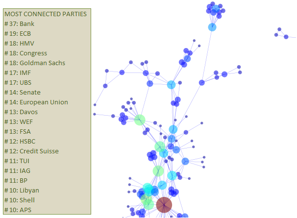
February Results: And, we might measure any number of stats to give us an idea of the shape of the news (overall) as well as at the individual / entity level, e.g. clustering coeffecients, average path lengths, number of neighbours etc. In other words, how the graph looks is not meaningless form over function; the graph's appearance conveys many messages regarding the nature of the underlying network.

June Results: Strong Clustering We might then begin to ask ourselves how that shape changes through time and examine any causal relationship with market variables, e.g. prices, volatility etc.
